Beautiful illustrations in academia
Everyone wants to get their ideas across. Researchers want visibility and bigger impact for their papers, teachers want their students to grasp the ideas they are sharing, and companies want to show off their products and systems in the best light possible. Technological fields of academia and industry rely much on the visual presentation of the matters at hand, and we should take that into account when trying to pitch our ideas to our audiences.
As human beings, we evolved to understand the world largely in a visual manner. The visual cortex of the brain is one of the first ones to start developing. Understanding of our surroundings, of object geometries, distances, relative sizes and properties, is largely gathered by visual stimulus. That is, we interpret the world mostly visually. What I’m getting at, is that humans use visual data to learn.
What this means from an educators perspective, is that to maximally facilitate learning in a number of subjects, visual aspects of the teaching material need to be considered important. For children, 1+1=2 is an abstract statement, but adding an apple to another makes complete sense. This idea can be extended to higher levels of education and to more involved subjects, until the subjects become so abstract that they can only be seen by the mind’s eye.
As a master’s degree programme student, I often suffer when I try to decipher the meanings of compressed figures on the lecture powerpoint. Here’s an example:
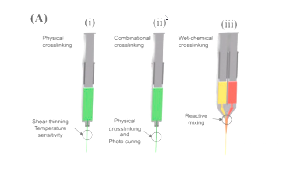
The cursor being the cherry on top.
Often I also thrive when a lecturer has put a lot of effort into making the presentation visually pleasing. I find it’s easier to stay engaged when there are interesting visual elements supporting what the lecturer is saying, and I think my peers (and others [1][2][3][4]) agree. I was a teaching assistant during last semester on a course labelled “the basics of mechanical engineering”, and got to test this out. The lecture materials and practice problems were scans from an 80’s book, originally hand drawn and everything. The students had trouble figuring the lot of it out, so I recreated some the figures and the feedback was good.
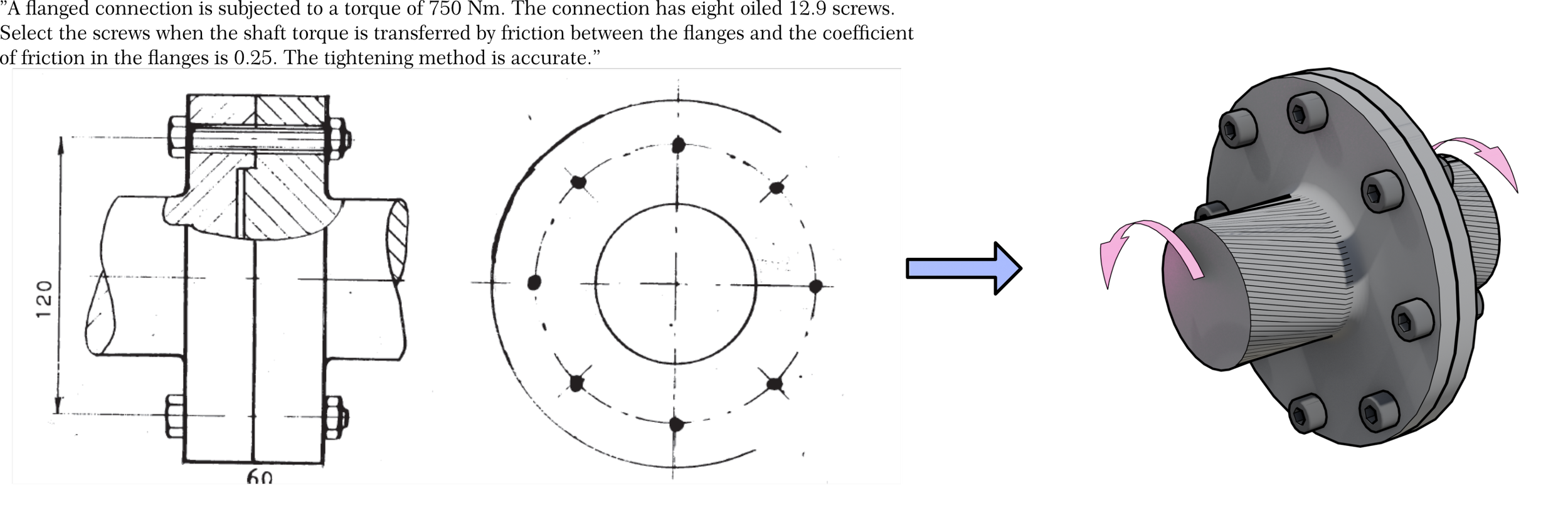
One of the recreated figures
Figures in research papers are the big storytellers. Text might provide the rigour that charecterizes the paper, but the figures tell the reader what the data means. By having well constructed charts and schematics complement the text, the reader can better understand the details. It’s not like a research paper is an illustrated novel, but making it read like one means that the reader struggles less. This makes for, again, better engagement and ultimately makes that piece of research more valuable and impactful for the community.
I understand that not everyone has the time or energy to commit to learning all the tools needed to make fancy graphics for their materials. So what can they do, when the content available online doesn’t cover their exact needs or the quality is just bad?
That’s what me and others (others and I, I’m late to the party) are trying to fix. Certain creators like Dr. J. G. Manion, who runs CGFigures and whose work I personally look up to, share their work as free public domain assets. As I updated my website lately, I added a gallery for illustrations. These figures are free to download and can be used where and how you please. This is an ongoing project and more stuff will be added there as time goes by.
And if you need something specific and want to support my ability to keep buying government sponsored meals at the school cafeteria, you should check out this file :)
[1]Enhancing Student Engagement: The Role of Embedded Video in Multimedia Lectures | TILE Conference
[2]Effect of student engagement on multimedia-assisted instruction
[3]Multimedia Course Design for Student Engagement and Retention
[4]Top 5 Benefits of Multimedia in eLearning